Login
Login
Cosmic Imagery: Key Images in the History of Science

Share

- Details
- Text
- Audio
- Downloads
- Extra Reading
We live in a visual age - an age of images - iconic, instant and influential. In his remarkable new book, John Barrow traces their history and influence in order to tell the story of modern science.
Certain key images have created our conception of the large, the small, and the complex - both of inner and outer space. Some, like Gresham Professor Robert Hooke's first microscope views of the world, arose because of our new technical capabilities. Others, like the first graph, were breathtakingly simple but perennially useful. The first stunning pictures of the Earth from space stimulated an environmental consciousness that has grown ever since. Many of these images have changed our view of ourselves and of the world around us. In this lecture, John Barrow takes us on a tour through the most influential images of science.
Download Text

COSMIC IMAGERY: KEY IMAGES IN THE HISTORY OF SCIENCE
Professor John Barrow
Michael Cooper
Good evening ladies and gentlemen. My name is Michael Cooper and, on behalf of Gresham College, I would like to welcome you all here this evening. Our speaker, John Barrow, is Emeritus Gresham Professor of Astronomy, but we are pleased to say that he will be the next Gresham Professor of Geometry, so we have much more to look forward to.
The change from Professor of Astronomy to Professor of Geometry has taken place once before, when Laurence Rooke, in the 1650s, decided to change from Astronomy to Geometry. It was rumoured amongst the academics of the time that the Gresham rooms for the Professor of Geometry were far superior to those for the Professor of Astronomy! But since Gresham College no longer supplies rooms, we cannot suggest that that has happened again, 400 years later. Lawrence Rooke was succeeded in his post as Gresham Professor of Geometry by Isaac Barrow, but perhaps there we have another story.
I have great pleasure in asking John Barrow to talk to us tonight on "Cosmic Imagery"!
John Barrow
It is very nice to have this opportunity to tell you a little about some of the contents of this new book that was published a few weeks ago.
The book is about pictures in science, and the role of pictures and images in the development of science. The first question everybody asks me is: "How come you write a book about pictures" What was the motivation for doing that?"
One of the motivations happened when II went, some years ago, to a conference which was populated by people from all sorts of different disciplines - there were linguists, there were scientists, there were people from the humanities and, god help us, there were even economists! So there were all sorts of people from different disciplines, and it was very interesting to see how they would present their papers at this conference, in a rather different style. The historians would stand up and read from their script very carefully to convince you that they were very, very serious; the physicists would use overhead transparencies; the mathematicians would write on the blackboard in chalk; the linguists would have everything prepared on handouts which they would give out. All those people would stand up. The social scientists would use the overheard projector, but they would sit down. The people in English would use handouts, but they would not even go to the front: they would sit around the table where we were all gathered and pass things around. So you soon learnt that there was a different style of presentation from subject to subject.
Gradually, this has started to be homogenised. What has happened is that we have seen things like PowerPoint; all sorts of associated technologies have started to make science, the presentation of science, and the reporting of science, much more visual and much more picturesque than it has ever been before; the sort of thing that you can show an audience of members of the public or colleagues at the university in science. What you can do now quite easily would have been unthinkable just 10 or 15 years ago. Scientists even publish work in the form of video or film. It is quite common to publish hundreds of colour images. You do not have them printed in the journal, but the journal asks you to click on an associated website, where you will see all the accompanying data and imagery.
It became evident to me that we were on something of a transition in the history of science in terms of how it Is presented, the role of pictures and images in the presentation of science, and also, as I will talk about a little later, with some examples, in the sort of science that is done. These new technical capabilities meant there were certain areas of science that could not be studied before, which suddenly became amenable to investigation, but investigation in a very new way.
Well, enough of these sorts of generalities! Let me work through a number of examples. I have picked them because they are just diverse examples from the book, which is somewhat more systematic, and much, much longer: there are many hundreds of images. They are chosen because they are important in some way and because there is an interesting story to tell about them, but they are not all necessarily images that you might have expected to find in a book purporting to have some historical connection with science. Some you might not have expected.
The flying saucer is an important image in science, and beyond science. It has come to epitomise extra-terrestrials and everything that goes on far away in our galaxy, that there are supposed to be collections of individuals who think nothing of flying millions of light years across the galaxy to land in a potato field in Epping before returning home a few hours later.
I once stayed in a hotel in San Francisco where there was actually a convention going on of extra-terrestrials, the extraordinary thing being all the people speaking in this convention claimed to either be extra-terrestrials or to have been abducted and returned. I was not speaking in the conference!
But flying saucers are these classic genres of science fiction in the late 1940s and early 1950s - it is always saucers. These are the preferred vehicles of propulsion if you are an extra-terrestrial. But where did this all come from?
There was a fairly wealthy American businessman called Ken Arnold who had his own 'plane, and a few years after the War, in 1947, he was flying to Boise, Idaho, from Mount Rainier, in his 'plane, and en route, he had this shock of seeing nine images that flashed across the sky. He followed them for a while, and then they disappeared off towards Oregon, he said. That is the sort of place that such things go, I guess! But when he landed, he called a little press conference, and he said that what he saw were "things skimming through the air like a saucer would," and immediately the local press went off and reported "flying saucers". This was the beginning of this terminology and these images.
A few weeks later, the New Yorker ran a famous cartoon, which was motivated by a mysterious puzzle about life in New York at the time, that garbage cans, as they are called in that part of the world, were disappearing from New York. People would wake up in the morning and find that their garbage had not only been collected, but their can had been collected as well. New Yorker ran a cartoon which showed, for the first time, one of these saucer-like vehicles in the local park with lots of little green men with antennae creeping out like ants and then coming back to the flying saucer, all with the garbage cans on their shoulder. That brought it very much to the public eye.
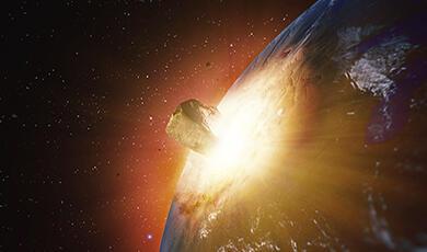
On to more serious matters of astronomy, there is one picture which is the first image taken of the Earth from space. It is not from Apollo 11; it is from the earlier mission, Apollo 8, which just went into lunar orbit. It is a picture of the Earth rising over Smith Sea on the surface of the Moon. The picture was shown on Christmas Eve in 1968. The remarkable thing about this picture is that, if you are old enough, you are actually on it, if you were outside at the time! But it is hard now, if you were not one of the people who saw that at the time, to really appreciate the impact of this image. This was the first time the Earth had been seen from outside.
Compared with the surface of the Moon, which looks so arid and totally uninteresting, the Earth is completely different to anything else that we had seen in space in the solar system. It looks rather beautiful, colourful, it looks dynamic and alive. We know what cloud patterns were about, and this image resonated greatly with the whole emergence of the environmental movement. Earlier books, like Rachel Carson's "Silent Spring", and Schumacher's "Care and Maintenance of a Small Planet", were reinforced dramatically by images from NASA's Apollo programme which, for the first time, showed people what the Earth looked like from space, how precious and different it was, and how worth preserving and thinking about.
If we go back, a little over 100 years, a famous drawing by the Third Earl of Rosse, or William Parsons, as he is known more conventionally. Rosse built the great Leviathan telescope there at Birr Castle in Ireland, which gave him the ability, for the first time, to see spiral arms and resolve stars in galaxies like the one we call the Whirlpool. It had been seen before as a blob of light by Mesier, and it was even catalogued by him as the fifty-first object in the Messier catalogue, but what Parsons saw were spiral arms, and companion galaxy, so there is a pair of galaxies which are interacting a little.
This drawing found its way to scientific conferences in London and Cambridge. It was drawn and reproduced all over Europe in the press, most importantly in Flammarion's bestselling books of the time. They were little analogues of the brief history of time. So everybody saw this picture, it was well appreciated what it was, and it was rather dramatic.
One of the people who saw it, undoubtedly, was Vincent Van Gogh. His famous Starry Night work has an astronomical image that has nothing to do with stars. There is a spiral galaxy, and it has even got a companion. No one can see a spiral galaxy like that with the naked eye. The only place Van Gogh has seen such an image is in the Earl of Rosse's drawing. We are fairly convinced that the prototype for the centrepiece of this image by Van Gogh comes from the early drawings of Parsons of M51.
One thing that has happened in astronomy and the imagery associated with it, is that when you talk about a picture of a galaxy, like the Whirlpool, there is no unique picture. If you look at it in the infrared or the ultraviolet or the radio or in x-rays, it looks quite different. All images in astronomy have a label nowadays that you have to identify them by - what are the filters used, what is the waveband being identified.
The Hubble Space Telescope has come to dominate our experience of astronomical images. Astronomical images typically that find their way on to the front covers of astronomy magazines or in the newspapers are generally not pictures of galaxies. They are more spectacular pictures. They are pictures of what we now call nebulae. They are stars which are exploding, and the light that leaves those stars causes surrounding regions of gas and dust fluoresce, you get dark shadows of dust, the scattering produces unusual colours, so it is nebulae that are the front page glossy magazine stars of astronomy.
The Hubble Space Telescope has played an important role in scientific imagery. There are no copyrights on any of the images from NASA's missions, and from Hubble in particular. If tomorrow you want to produce and publish a glossy book, with 100 Hubble Space Telescope images in, you can download them from the web with the highest resolution you require, and just publish them. No permission needs to be given, no royalties need to be paid to anyone at NASA - US taxpayers have paid for all that for you. This was an astute move by NASA of course. What they wanted was publicity. They wanted their images shown around the world.
There is one picture of the Eagle nebula is showing a region where stars are starting to form. It shows gas and dust and molecules which eventually are going to make star-forming regions. They are growing up like great stalagmites from the bottom.
The interesting thing about this picture, if you look at it also from an artist's points of view, there is something familiar about it. You have to appreciate that if you were in a spaceship looking at the Eagle nebula, you would not see the same colours, so the people who create these pictures have some latitude in the colouring, the shadowing, and the presentation.
After you have looked at a lot of American pictures, you begin to wonder a bit about Thomas Moran, the great nineteenth century artist of the discovery of the West. If you look back at some of his great pictures, like the Colorado River and the Yosemite Falls, you begin to see what the connection is between the colours and the feel of some of those space telescope images. It conjures up the same exploration and discovery of the West imagery and feel, and some art historians have become rather interested in pursuing what might be the connection between many of the effects in those Hubble images, often quite unconsciously injected, and these famous nineteenth century images of the West.
Let us now go backwards in time. The images discussed so far have been very much to do with astronomical advances and somewhat oblique uses of them. If we go back to the first half of the sixteenth century, we are encountering the period when the first printed books, with moving block printing, came on the scene in science.
The first one, in 1542, was the famous History of Plants, with beautiful botanical pictures. One year later, we have Vesalius, the Belgian anatomist who worked in Padua, with his famous book of anatomy, of the human body.
It seems extraordinary to us now that, before this time, books on anatomy did not feel it necessary to inspect or report what the human body was like. They were mainly reiterations and celebrations of what Galen had said in the year 250, so they were rehearsals of Greek thinking about the human body. Vesalius' work was based on cutting dead bodies up and, in the frontispiece of the book, you have a rather gruesome plate, which is the table of the instruments that he uses to cut the bodies up. The point he is making here is that this is public knowledge - if you want to check this for yourself, these are the tools that I used, and this is all you would need in order to verify this public knowledge.
The huge number of illustrations in this book are really works of art, and we will see in a moment, in many, many places, like the History of Plants and with this volume, you just get the feeling that to be a scientist at that time, you had to be a very, very talented artist or you had to know someone who was. These pictures are not mere illustrations; they are works of art. These figures look like the living dead - they could step out of the page. Running along the backdrop is a continuous panorama of the countryside near Padua where he lived, and it continues like a frieze from page to page. There are hundreds of these fabulous pictures, and the interesting thing to think about (and you can read my little essay about it if you want to know the detail) is to consider this is the first step in a process that led to what we now call the scientific textbook.
If you jump forward, to the middle of the nineteenth century, then you run into the first edition of Gray's Anatomy. What has happened to anatomical illustration?
There are about 900 pages in the first edition of this book, in 1858, with Van Dyke Carter's wonderful drawings, but they are quite different. They are figures, they are diagrams, they have letters and symbols and arrows. By1918 it had not changed very much. We see over that period the professionalisation of illustration of textbooks for students, for people who have to pass exams. These are not Vesalius' illustrations, although if you are a practising doctor they are much better, they are more accurate, and they are no doubt more useful, but you would not put them on your wall.
A century after Vesalius came a great London figure, Robert Hooke, with the wonderful frontispiece of his Micrographia. You sometimes have dramatic images appearing in science which are influential because a new technology allows you to see something that no one had been able to see before. In Hooke's case, it was the microscope. Hooke's invention of the microscope enabled him to unlock and show the world this fantastic, microscopic realm of unimagined intricacy. This book is very spectacular, if you look at a real edition. The pictures generally open out as great double spreads, and the pictures were done by Hooke himself. He was a talented artist. As a teenager, he was apprenticed to become an artist, so his family were expecting him to become a painter, but I think he had to stop that - he was allergic to some of the pigments and the paints - and he became a scientist instead, but he retained the talent to be able to produce drawings of this quality.
Robert Hooke's famous picture of the flea has got little letters and numbers on it, in order that he can refer to it in his lengthy caption. The influence of this picture on others was really rather remarkable. There was a whole natural theological tradition of individuals interested in the intricacy of the created world and whether was it was designed by God for our convenience, whether it was designed for somebody else's convenience, and this suddenly rejuvenated that subject area. Instead of just looking at fairly large scale contrivances, you had a totally unexpected picture of what was going on in the engineering of the microscopic world.
We will now move to some mathematics for a while, and to another example which ultimately will rest upon technology.
You probably all know of fractals. Ever since the 1970s, when Benoit Mandelbrot coined the word "fractal", have become the pinup of mathematics on mathematics students' walls. Artificially generated trees and flowers all carry this extraordinary fractal signature. When did it begin and what was it about?
The first paper where something like a fractal appeared was by Helge von Koch, back at the beginning of the twentieth century. He, for the first time, creates a structure that we now call the snowflake fractal. In a rather simplistic picture, all he does is draw a line, erect a triangle and then, on that triangle, he takes out the middle third of each side and erects another triangle, and then he takes the middle third out of that one, and so on, and he keeps going for ever. You have a structure that, if you look at it under the magnifying glass, has the same basic form as if you look at it full size. So a fractal is an object which is self-similar, it is scale-invariant; it does not matter if you look at it magnified or reduced, it has the same basic distance symmetry from one scale to another.
Later, people would invent other spectacular examples in three dimensions. There is a cube that Karl Menger created, and you keep hollowing it out in a systematic way, and you keep going for ever, and you have a structure which, in some sense, has a zero capacity, but it has a finite surface around it.
What Mandelbrot did was to use the power of IBM in the 1970s, where he was a research scientist, to reveal the intricacy of these structures in ways that would have been completely impossible before there was that type of computer power. The whole study of complexity and chaos, which is now so much a key part of science, began in the mid-1970s, and it began because personal computers became available. These sorts of subjects cannot be studied just with pencil and paper. They are not a system of simple equations that you can solve exactly. If you want to understand how a complicated interaction takes place between different populations of animals with different degrees of probability, you may not be able to solve it exactly, but you can tell the computer the rules of the game and watch the game unfold in a film or a sequence of stills.
What happened with the personal computer revolution was that capability fell into the hands of individuals, or just small groups of people. There had long been computers, but they cost millions of pounds, and they were controlled by ferocious research groups who were very keen not to allow anyone else to do anything else with them. They studied exploding bombs, the building of stars, predicting the weather or the economy - blockbusting problems. But in the mid-1970s, a single person could study something like the Mandelbrot set with a small computer.
The Mandelbrot set is rather remarkable. It is a mathematical operation that takes a point in the plane and sends it somewhere else, and then keeps on repeating that operation over and over again ad infinitum. The rule is very simple but, if you keep applying the rule, most points will get sent a long way away. A black boundary shows you the points which stay at a finite distance so, if you start with these points, you can iterate as much as you like and they will not get sent far away. It has a funny cardioid-type structure - it looks like a heart - but the interest starts when you look at the boundary under a magnifying glass. It is infinitely complicated.
If you look at part of the boundary again and again under greater magnification, what you find is the whole cardioid region reproduced over and over again, so there is no limit to the intricacy of the boundary. If you keep looking at greater and greater magnification, you will just find more and more and more copies of itself on smaller and smaller scales. This is really something of paradigm in mathematics for the study of intricacy and complexity.
Another striking technological development, which created new images, was high speed photography. High speed photography comes along only at the end of the 1890s with a gentleman called Worthington, who set up a rather intricate array of cameras, all cleverly triggered at slightly different times. If he drops a spot of milk into a bowl, he takes many, many photographs, all very slightly separated in time, to watch the whole sequence of the falling drop and the splash.
His first pictures of milk splashes appeared in 1897-1899, and this is the beginning of high-speed photography. If you are of a particular age, you may remember the Milk Marketing Board, whose logo on its tankers was an object taken from one of Worthington's famous splash pictures.
The whole business of high speed photography was very much souped up and taken over by an amazing group in America at MIT, known as the Strobe Alley Group, run by Edgerton, who created lots of the special effects that you would see in the movies. He is the person who made the underwater cameras for Jacques Cousteau and for the discovery of the Titanic. He used to like to release pictures every so often, just to show you how clever he was. There is a famous sequence of bullets passing through playing cards, which are done by stroboscopic techniques.
Such pictures are made automatically, but in many ways we have seen already how individuals with extraordinary skill play a key role in fashioning influential images. Leonardo was one of the creators of particular ways of visualising polyhedra in spectacularly impressive ways, but the great illustrators of the twentieth century are often forgotten when people talk about scientific imagery.
Generally, people regard the greatest scientific illustrator of the twentieth century as Irving Geis. Geis worked in the Second World War for the US intelligence services, making drawings and maps and things of that sort. After the War, he was grabbed by Scientific American to be a special illustrator whenever they had a remarkable challenge to meet, and the most famous challenge was a picture which became a legendary image in scientific illustration. It was a whole page image in Scientific American in 1948. It is a watercolour painting of the myoglobin protein from the sperm whale. It is a nice and large protein. It was understood originally by Kendrew in the late-1950s, for which he received the Nobel Prize. A few years later, Scientific American wanted an article from him about this work.
Kendrew worked with all manner of ball and stick models, and pictures taken from different angles by x-ray crystallographic techniques, and he had an extraordinary intuition for the three-dimensional geometry that was being shown in different directions. He dumped all this I think on Geis' desk and told him, "You'll have to make a picture." Geis spent about eight months creating an amazing picture. Everything on it has precise and exact meaning: the changes in colours, the distances between the atoms, the perspective, the orientation. It is a very remarkable picture.
When I was seeking out this picture and to ask if I could use it in my book, I contacted Irv Geis' daughter, Sandy Geis. In America there is a gallery that one of the big health companies has created of his work. She sent me a picture, which she hoped I would use. It had never been seen before, never been reproduced before, and she said it was simply that this is how she remembered her father when she was a very young child. The picture shows Geis sitting next to the picture, unfinished, taking a break between painting. She told me she remembered him wearing telescopic glasses, because he would be working sometimes with a single strand of the paintbrush in order to get the texture correct. Geis died around 1990. Such pictures play a role in helping you visualise what is going on. If you did not have a picture like that, your job as a molecular biochemist would be really rather difficult.
The next group of pictures that I will talk about show you show you something that most people are surprised to learn is a rather late arrival on the human intellectual scene: the graph, the good old graph. Everybody thinks the Greeks must have been drawing graphs, and Isaac Newton must have been drawing graphs. Neither of them ever did!
Nobody knows who drew the first graph that I, or anybody else so far, was able to find. It was drawn in the tenth century by an unknown monk in France. He was giving some lectures to his students, and he wanted to illustrate a passage from Pliny. Rather than reproduce all the words about where the planets were (here is Saturn, Mars and so forth) he used 30 gradations, obviously the days of the month, and the 12 zodiacs, and he represents how they change with time. The picture is not quite as simple as it looks. He is using a different scale for every object, it turns out. But this is the beginnings of graphs. Nobody else seems to have much used what he proposed.
You have to wait until the mid-1300s before you find Erasme using graphs that he called latitudes in a slightly different way. They look like graphs, but they have no scales, they usually have no axes, and he uses them as a sort of shorthand. Sometimes you will find these pictures in miniature in a line of text, and instead of saying, "We are now going to think about motion where the speed increases for a while, then it stays the same, and then it falls off," he will say, "We are going to think about motion like this," and he will draw a little picture. So it is like shorthand in the text. His motivation for doing it was because at this time, in the medieval period, he is enamoured by geometry, and he thinks the world is geometrical. It is important for him to try and make things appear geometrical, even if they do not at first seem like that; so reporting variations of speed against time in this way makes them seem geometrical.
But if you look at his other work, you begin to see perhaps some of his inspiration for creating the pictures. He was a serious musicologist, one of the first musicologists, and he evidently appreciated something that had also been done in the eleventh century: the invention of the musical score.
This is very much a graph, sound against time, and Erasme used musical scores, he discusses the relation between music and motion, and produced rather beautiful illuminated musical scores, invented so that the singers in one abbey would know that the singers in another abbey were sounding roughly the same when they were going to come together. They deserve a place in any story about graphs.
But the sort of graph that we have to draw at school is a rather late arrival on the scene. The earliest one I have found dates from 1669, by Huygens, and is the sort of graph that will be interesting to the City actuaries. It shows how much longer you should expect to live if you are a particular age. So it is the first continuous function that is drawn as a graph. Huygens of course a great Dutch scientist, and a very skilful grinder of lenses. He sent Newton a wonderful lens which Newton used for his optics experiments, and you can see that on display in the Royal Society.
By the end of the eighteenth century graphs are really appearing on the scene and being used by scientists and people interested in displaying information. James Watt invented the pen recorder, an automatic device which tells him how the pressure is changing in his steam engines. But Watt being Watt, a good businessman, did not tell anybody about this, and he kept it a secret until about 1822/1823, so it was a commercial secret. However, I always find it slightly suspicious that the person who usually gets the credit for introducing all sorts of graphs wholesale into the world at large was somebody called William Playfair, that happened to be an apprentice to Watt in those early years. Playfair produced two wonderful books, one called Statistical Breviary, where he invented all the sorts of bar charts and pie charts that we are familiar with today.
Someone else who played a role was Florence Nightingale. She also invented some of the ways of displaying information in pie charts. The reason she was a successful nurse was partly because she was one of the pioneering founders of the Royal Statistical Society. She was a serious statistician. She used statistics to monitor which treatments were working and which were not, and stopped doing the ones that were not working.
The whole study, the presentation of information, comes along at the end of the eighteenth century and the beginning of the nineteenth century. Statistics, of course, were very controversial, regarded by some people as a great evil. Someone like Charles Dickens regarded statistics as a serious social evil, and books like Hard Times were directed against statistics and the sort of people who used them. He thought they were a great evil because of concepts like the "average man" or the "average woman" which he regarded as just an excuse not to help individuals. The Government could say, "The average wage is increasing," even though many people were in poverty and destitution, so Dickens regarded this whole way of looking at the world as wrong.
I will now talk about a few things that are not so obvious, perhaps, about maps.
Mercator's projection of the Earth, you all know, but less well-known is the cover of Gerardus Mercator's first book of maps in 1585. It contains a rather skinny-legged Greek titan. This is Atlas carrying the world on his shoulders, and this is why books of maps were ever after known as atlases, because Atlas appeared on the cover. The book had a particular paper size format, so atlas paper size then became the standard map paper size.
Many, many generations of wonderfully drawn maps came on the scene. I will mention a few which were influential in odd ways.
Way back in the nineteenth century, Gall produced the first equal area projection of the globe of the Earth on to flat paper. Mercator's projection is distorting. As you move away from the Equator, countries appear to be much bigger in surface area than they really are. Greenland appears to be an enormous territory. If you go there, you will be surprised. Some people always felt that this was a bad distortion. There was a reason for the distortion: the distortion made Europe and the colonial countries of the period not only at the centre of the map, but they appear much bigger and much more important geographically than they really are.
In 1972, there was a great fuss in the world of cartography, known as the "map wars", when a fellow called Peters became very, very excited about recreating a projection, which he sold to the United Nations as being the way the world should be represented out of fairness to the third world and other emerging countries. This is an equal area projection of the world, so the area of South America and Africa is correct. The shape certainly is not, and this is why this projection is not very popular. I think one cartographer described it as the Southern Hemisphere hanging out like washing on a line, spread across the Equator. But you can see what happens if you make an equal area projection, and why the whole issue of representing the world on maps is fraught with politics and controversy. Of course, if you live down in Australia, you can do the same thing and turn it upside down, and put Australia in the centre of the world.
But there are other maps, in some ways more interesting to us and less well known. There is the first weather map, published in The Times on 1 April 1875. If you look carefully, you can see it is the previous day's weather, so it enables you to understand what happened yesterday. Later, it graduated to telling you tomorrow's weather. The originator of weather forecasting and weather maps was Francis Galton, who invented fingerprinting and many controversial statistics as well. University College London have the original metal plates of his map in their library. The map has many features that you recognise (and I don't mean Ireland and Wales!): wind directions; information about speeds. It has no isobars yet - that comes rather later. But this is the beginning of putting science in the newspapers for the public in a way that is supposed to be digestible.
Another type of contemporary map that is unusual appeared when Apollo allowed us to look at the Earth from space. We can take a picture of the Earth at night, as it were. We can look at parts that are in the shadow, and piece together a whole map, and it is a projection. What you see is a map of lighting and illumination over the Earth. What is striking about it is that the light does not really trace the population. There are huge regions with vast populations where there is not so much light, and some regions where there is not too much population where the light is completely dominant. The light traces the money. You can see that we have the ability to create many images of the Earth now in his way, to reflect difference in behaviour, difference in agricultural output, differences in pollution. So, there is no unique picture of the world.
Nowadays, we might also think of the world as not so much being made of geographical locations and places, but of connections. This is shown in a map of the internet information highway, just over North America, and it gives you a picture of the connectedness of the world - who is in contact with whom. If you look at a worldwide image of this, you can guess what it is going to look like, which places are included, which places are excluded. We are suddenly creating in cyberspace a rather different sort of map of the world.
The last map I want to discuss is one that is rather familiar, and it is also a map about connectedness. This is one of the very first London Underground maps, from 1908, and when you look at it, really it is a bit of a mess. This dates from just around the time when some of the lines were starting to merge. This is an ordinary map. The stations are place at the positions where they really are on the London surface, and that was the problem. People were not much using the London Underground in this period. It looked such a complicated and messy enterprise.
By 1931, Stingemore had produced a newer version of this map. It is still a geographical map, so the stations are still where they really are, and travelling from north to south, say, is a major enterprise. It is not apparent how to make changes from one line to another. Not surprisingly, people were not much using the London Underground in the 1920s. It looked like a major expedition, too complicated, and it was failing financially.
Then in 1925, a young man called Harry Beck came to work as a draftsman in the drawing office at the underground railway, and in his spare time he was allowed to do freelance work. One of the things he embarked upon, unbeknown to his employers, was to create a new map of the London Underground. I have a reproduction from his exercise book, which shows the first time he drew his first draft for the map that we were eventually going to see.
Beck first worked in electronics, and it is no accident that the London Underground map looks rather like a circuit board. All the lines are horizontal, vertical or at 45 degrees. Gradually, over the next few years, he moved towards what he called the diagram, the Underground diagram - he never called it a map. Eventually, after some rejections, it was enthusiastically taken up by the company. They printed three-quarters of a million small and large copies of it and distributed them free of charge.
What he did here was rather revolutionary. This was the first topological map, so the positions of the stations do not reflect where they really are. That does not matter if you are travelling under ground - who cares where they really are?! All you want to know is the next station, and how to change to another station. What Beck did was to enlarge the inner region. He said he imagined himself looking through a lens which would enlarge the inner region and bring in the outer region. So all those people living in Cockfosters and Morden and Richmond and Uxbridge really thought they were close to the centre of London - they were not of course, but this changed the way Londoners thought about London. It is how most of us think London is. It saved the day in that it made travelling from Uxbridge to Piccadilly Circus look really a rather short and simple journey.
Over many editions, he changed the way he represented the stations, and the exchange station notation. It is all rather clever and elegant, and one of the great classics of modern design. Eventually, the underground railway snatched it away from him. I think he sold the rights for about a fiver - it is one of those stories! Eventually, there was a different sort of map that had to encompass the Victoria Line and so on.
The last image I want to talk about is iconic. Einstein has come to represent science, physics, the conquest of the mind, if you like, in the public domain. It is rather remarkable. He did not have an agent, never made a film, did not have a web site, and yet he is the most instantly recognised face probably on the planet. Also, strangely, his image has come to equate science and scientists with a slightly elderly gentleman with white hair or, even worse, a slightly eccentric gentleman, relaxing at the beach. This is strange to scientists, because we know that when he did his great work, he did not look like that at all. He was a rather smartly dressed, dapper young Swiss scientist and patent worker. It was only when he came to the US, in later life, that his appearance and style changed. The interesting story there is that his style of doing science changed too. So when he was young, he had quite a different way of working, very intuitive, focusing on the physical phenomena, using as little mathematics perhaps as you need to represent it; but when he moved to America, he became ensnared and enamoured by mathematical formalisms, and he started with intricate formalisms and tried to force the world into those formalisms. None of that later work really in America was successful; none of it really lasted. It is all the earlier work, from his younger days, that is famous and much celebrated.
That is the end of the story - l leave you with the young Einstein. If you want to learn a little more about some of the pictures I have discussed, and something about several hundred others, then I encourage you to purchase a copy of Cosmic Imagery!
©Professor John Barrow, Gresham College, 29 April 2008
This event was on Tue, 29 Apr 2008
Support Gresham
Gresham College has offered an outstanding education to the public free of charge for over 400 years. Today, Gresham College plays an important role in fostering a love of learning and a greater understanding of ourselves and the world around us. Your donation will help to widen our reach and to broaden our audience, allowing more people to benefit from a high-quality education from some of the brightest minds.