Login
Login
Portraits of Queen Elizabeth II: The Artists’ Challenges
Share

- Details
- Text
- Audio
- Downloads
- Extra Reading
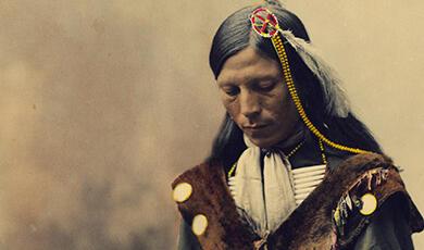
Scores of painters and photographers over the last seventy years have grappled with the formal portrayal of Queen Elizabeth II from life. These range from the celluloid fantasies of Cecil Beaton to the directness of Lucian Freud; the Renaissance-inspired divinity of Pietro Annigoni to the naturalism of Annie Leibovitz.
Underlying all her official portrayals is an artistic conflict: the requirements of royal iconography and the demands of the usually conservative institutional commissioner, versus modern expectations for artistic self-expression and psychological authenticity.
Download Text

Portraits of Queen Elizabeth II: The Artists’ Challenges
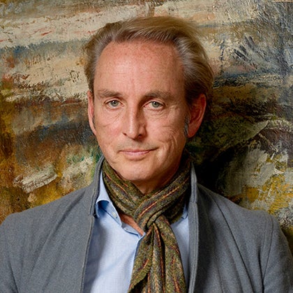
Mr Philip Mould
2nd March 2023
When Professor Simon Thurley, Former Provost of Gresham, asked me to do a talk about the Queen for the series ‘Portraiture and Power’, I immediately agreed. Given a lifelong career in British art, and a particular interest in historical portraits, it sounded enticing.
The enormity of the challenge – and possible unwisdom of taking it on – hit me a couple of months later. It is worth being reminded of what that fine historian (and former chair of the National Portrait Gallery) David Cannadine once said about our greatly loved monarch: “(She is) probably the most visually depicted and represented individual ever to have existed across the entire span of human history”.
A daunting task of iconography became significantly less, when I decided to narrow it down to portraits that I find most fascinating. These are formal portraits – photographed or painted – for which the Queen actually sat and engaged in a direct communication with the artist.
In my experience, the eyewitness account has consistently proved to be more authoritative and compelling than that from a secondary source. It is certainly a view shared by historical institutions, including the National Portrait Gallery.
And though Angela Kelly (the Queen’s Personal Assistant and Senior Dresser) has revealed that one of the Queen’s most secret wishes was “to pose with her hands in her pockets”, nor will I dwell on the unofficial portraits – single, family (or couple!) – which undoubtedly have appeal and validity too.
Instead, I shall be talking about formal life portraits of Elizabeth after she had become Queen that were actually part of her day job. These are:
- works commissioned by institutions for which she was a figurehead – army regiments, livery companies, charities that had a strong expectation upon the portraitist to produce something appropriately iconic;
- and photographs and paintings that she and her advisers commissioned for special occasions such as birthdays, jubilees, and overseas tours.
In all, since coming to the throne, I calculate about 412 formal sittings, but there must have been many more. I’ll be looking at the ways in which these artists approached their task; what the images tells us about the expectations of their time; and how, in varying degrees, they all connect to intriguing traditions in wider art history.
The logistical issues faced by any travelling portraitist can be problematic, but for the royal sitting, they were often terrifying.
The Yellow Drawing Room at Buckingham Palace, the favoured principal location, was for some portraitists an artistic chamber of horrors. Setting up an easel or tripod in this overly ornate and other-worldly environment was challenge enough for what might be – for better or worse – one of the defining portraits of an entire career.
Then there is the issue of time. Unless an artist was particularly privileged, the length of a sitting was not very long: two or perhaps three sittings of 50-minute for a painter (especially in the later decades). A photographer might get as little as half an hour. This restriction certainly frustrated some painters to the point of failure.
For all of them, careful planning was required, as well as the occasional stroke of good fortune. And most painters made up for the lack of time with ‘working photos’ taken during the sittings, that they could then use back at the studio.
In addition to these practical problems, we should also consider the emotional ones. Inevitably, many artists were nervous when they met the Queen. On the other hand, all the ones I’ve spoken to and read about say she was a model sitter – by nature accommodating, interested, conscientious, chatty, and humorous. As the photographer Annie Leibovitz put it: “It was her duty […] she totally gave herself over to the process, to the photographer, or the artist or the painter, to use their creativity and their imagination.”
At the risk of stating the obvious, the frisson of the encounter surely goes to the heart of what defines a royal portrait: the depiction of the ‘Royal Presence’. How do you convey the ineffable qualities of the head of state?
The Monarch’s position derives from a combination of birth, “God” (at least that’s the traditional view), and what is for a modern democratic society a strange notional gift: the Royal Prerogative. Although in practice this is rarely tested, the Monarch has the unique power to enact things like the dissolution of Parliament or the declaration of war. Inevitably, this creates a unique iconographic challenge.
Empathise for a moment with the quandaries and contradictions facing the portraitist who is first ushered into the royal presence: apart from capturing a recognisable likeness, where on earth is a portraitist supposed to start? Symbolic objects, backgrounds, and outfits are the easy bit. But how can they going to express the spirit of a person who is both crowned Monarch and servant of her “subjects”? Who symbolises and stands as figurehead to the nation and the Commonwealth, but also as comforter to her people? Who represents solid continuity, but also aims for progress and enlightened change? Someone who is one of us, but clearly not one of us. Who is both ordinary and utterly extraordinary. How in a single physical image are all these abstract concepts portrayable?
For the purposes of this talk I have selected a number of portraits that I feel succeeded in this high wire artistic act. They captured Elizabeth’s persona as it changed and distilled her ‘magisterial mystery’.
Let me explain now how they did it.
The portraits I want to talk about seem to me to fall into three categories divided by age:
- The first category includes two portraits of the young, newly-crowned Elizabeth. They were made in 1953 and 1955 respectively, and are amongst the best-known and most influential of all: Cecil Beaton’s coronation photograph, and what we call ‘the first Annigoni’;
- The second category, which I call the Middle Ages, takes us from the 70s to the 90s, and demonstrates a democratizing change of mood. This comprises portraits by (the two Michaels), Noakes and Leonard;
- And the third category reveals what I call ‘the Venerable Queen’ – powerful pictures from the penultinate decades of her reign. These include Freud, Levine, and Leibovitz – the latter two being probably the most successful.
Let’s start with the son of a wealthy timber merchant whose nanny, when he was a child, gave him a Kodak 3A Camera to play with. He would be the first to pull off the artistic balancing act of capturing the new Queen’s emerging regal persona and her deep ‘magisterial mystery.’ Cecil Beaton was an ideal amalgam for the job: fashion photographer, and renowned designer of costume, theatre and pageants, as well as artist, interior designer and more besides. A genius at evoking the past in the mode of the present, he took royal portraiture to a new level with a series of images at Buckingham Palace on the second of June 1953. I’ve chosen this one as the most representative.
The twenty-seven-year-old Queen had just returned home from the ceremonies of the Coronation which culminated in a three-hour service at Westminster Abbey watched by an unprecedented television audience of 20 million. Despite what must have been a grueling day, the Queen was clearly up for playing her new role.
Beaton deployed his theatrical genius by commissioning a painting of the Henry VII Lady Chapel in Westminster, which he then enlarged photographically. This was placed in the Green Drawing Room at Buckingham Palace, and the Queen duly sat before it. Painted backdrops had been used from the very earliest days of photography, supplying a form of instant theatre, and for Beaton it gave the composition a comfortably regal atmosphere in preparation for his next trick. With a nod to Hollywood, and a fashion photographer’s boldness - assisted by a colleague from Vogue - his masterstroke was to place a huge 1000-watt bulb behind the Queen’s head. It was both extraordinary and transformative in creating a dramatic burn-out effect: the visage of the new monarch emerges with almost supernatural clarity.
Beaton was also steeped in historical portraiture (he had once attended a pageant dressed as a self-portrait by Thomas Gainsborough!) It’s clear to me that he must have been familiar with George Hayter’s coronation portrait of the 19-year-old Queen Victoria of 1838. A young woman weighed down with glittering regalia, Hayter came up with the compositional device of both heightening and lightening the composition by having the queen’s sceptre pointing heavenwards at an 80-degree angle.
The confection of reality and fantasy was a sight for sore eyes in austerity Britain. Society was still bruised from the war. Bacon, butter, sugar, and eggs were all still rationed. The Cold War had begun in earnest. On the radio that night prime minister Winston Churchill, at his portentous best, described the Queen as: “The gleaming figure whom Providence has brought to us in times when the present is hard and the future veiled”.
Beaton’s image crystallised what the press started calling 'the new Elizabethan era'. Beaton went on to produce many more beautiful studio images throughout the middle years of the Queen’s reign and I could devote an entire lecture to those alone! But other portraitists are beckoning.
It was now up to someone to do the equivalent of Beaton in paint. It came, two years later, thanks to a commission by a board of fishmongers. This result so thrilled the public, that when it was first exhibited, you would have had to jostle with crowds ten deep at the Royal Academy to see it.
In recognition of their royal charter, and to mark the completion of restoration works at their Hall, the Worshipful Company of Fishmongers in the City of London commissioned the Milan-born Pietro Annigoni to portray the 29-year-old Queen. Annigoni seductively combined old master technology with modern allure. Particularly good with young subjects, he had become something of an international star, his work frequentlyy showing at London’s leading commercial galleries. The Fishmongers turned to him because they could find no British portraitist of similar stature. As a requirement for his technique, Annigoni persuaded the Queen to grant a notable fifteen sittings (although he had actually asked for thirty!). It appears though to have been enough. The transformative power of Annigoni’s creation endures to this day. Many people still regard it as the zenith of the Queen’s painted iconography.
The question is how did he do it?
Annigoni painted this in the archaic medium of quick-drying tempera. That is, pigment mixed with egg yolk and applied directly onto paper rather than canvas. This gave it a smooth, flawless finish, reminiscent of early Renaissance panel painting. A dark blue figure, silhouetted against an idealized landscape with a low skyline is suffused in warm light. This was a clear homage to the founding giants of the Italian Renaissance like Raphael and Leonardo. It was brilliantly apposite for the subject. Annigoni imbued the office of sovereign with the mysticism of continuity, rafting the viewer back to the birth of royal and religious easel painting in Europe.
Annigoni was also a master at infusing his subjects with very modern, filmic, sex appeal. So successful, in fact, that later in his career he had more women subjects than he could cope with. For the face of Windsor, he pulled out all the stops. The Observer called the painting “smooth and meretricious”, but the public loved it - for it seemed to deliver the dream of the new Elizabethan age. The royal family, according to Annigoni’s memoirs, felt the same. Princess Margaret even complimented Annigoni’s rendering of her sister’s mouth: “a feature,” she said, “that usually provided great difficulty for portraitists”.
But what about the broader characterization? The pose, the garments, the way the Queen’s eyes linger on the middle distance. To me these aspects are the most compelling. Annigoni claimed her gaze was evoking her time as a child looking out of the Palace window onto the Mall. Personally, I disagree. It looks to me more like a stock facial formula employed by Titian and others for male dignitaries: the middle-distance gaze of detached authority and political power. See this comparison to Titian’s Charles V:
This reading is further underpinned by her attire. The Queen is wearing the formal clothes of the Order of the Garter, most notably the cape. Originally an outdoor garment of action known as ‘the mantle’, Annigoni gives it a radical and ingenious new spin. He makes no attempt to show the underlying dress, or to include jewellery as, for example, was done for her aunt, Queen Mary, in her Garter portrait (shown here).
With a theatrical flourish, her mantle becomes her. In so doing Annigoni effectively steers the new queen’s appearance into something more appropriate for a post-war era.
Her modishly short hair adds to the effect. An informed public may also have clocked references to the caped, solitary figures of Wellington and Napoleon as portrayed in popular battlefield prints. This was more marshal and heroic than any artist would have dared do to the young Queen Victoria. With the trope of the all-covering mantle, to which we will return, Annigoni introduced a more modernist, gender-levelling image of sovereignty: and he did it with stealth, using the language of the Renaissance.
We move now to the 1960s and find a Britain suffering a sharp decline in the standard of society portraiture. The form had fallen from favor - and few artists of talent were drawn to the genre. Before the Second World War, society portraiture had been riding high with the likes of Lavery, Orpen, De Lazlo. But now the avant-garde had taken hold and abstraction dominated the art world. In a Britain coming to terms with a loss of empire, the feudal glamour that underpinned the language of society portraiture was beginning to feel irrelevant.
Amid the momentous social and cultural change of the time, attitudes to monarchy also changed.
The brightness of the ‘Fairie Queen’ had unquestionably dimmed. In 1957 the hereditary peer Lord Altrincham, shown here, a man I met before he died, dared to observe that Elizabeth’s formal style of delivery sounded like “a priggish schoolgirl and captain of the hockey team”! Two months later the popular journalist Malcom Muggeridge was banned from the BBC for suggesting that the “tedious adulation of the royal family” was bad for them, the public, and for the institution of monarchy. But they were only saying openly what many privately had now begun to feel: that the Queen was out of touch and becoming constitutionally irrelevant.
Such sentiments hardly threatened the Crown, but they seem to have persuaded the Queen and her advisers that something had to change. In 1958 the custom of presenting debutantes to the Queen was dropped. This was seen as a significant move away from elitism. And later that same year she forsook the invisibility of her Christmas broadcasts on radio and addressed the nation on television instead.
So what kind of imagery could capture the spirit of this new age of social mobility? In the previous century, Queen Victoria was almost entirely known by the painted, printed, or contrived photographic studio portrait. The second Elizabethan age, on the other hand, demanded greater access and informality underpinned by photographic and cinematic technology.
The tastefully relaxed family photograph partly answered this need, and could be released on special occasions such as birthdays and anniversaries. They came most memorably from the trusted inner circle of Lord Snowdon and Patrick Litchfield.This studiedly informal “family album” image was published at Christmas in 1971 and was probably Lichfield’s greatest success. It is in fact three separate shots stitched together. Its contrived informality puts me in mind of early 18th century painted conversation pieces. Or it is the ultimate image of – to quote Prince Harry – “one very large, very ancient, very dysfunctional family”.
Meanwhile, the unstoppably potent medium of television had also been deployed in a desire to create a thoroughly modern image.
In 1968 the Palace seized a full-blown PR opportunity. It decided to allow the royal family to be filmed for an entire year for a ground-breaking 90-minute fly-on-the-wall documentary about the Queen’s life. The Palace retained full editorial control but Royal Family, as it was called, would become a sensational national event. It was broadcast in June 1969 on both BBC and ITV and drew an audience of 38 million in this country (including myself, aged ten!), and 350 million worldwide. The wisdom of letting in a film crew is still debated but at the time the general reaction was overwhelmingly positive. The Queen now fitted into the Swinging Sixties. As one journalist put it, she is a “a warm, friendly person, with a thoroughly engaging sense of humour”.
But the formal royal portrait remained hugely important. It continued to function as both constitutional statement and essential artefact for bodies desiring to express their linkage to the Crown. Around the time of the TV show, Roy Strong, director of the National Portrait Gallery, commissioned a portrait of Elizabeth for the nation.
Thinking first of a family group, but fearful of commissioning something artistically retrograde, Strong sought advice from Lawrence Gowing of the Tate Gallery. He was the wrong person to ask. Unless he got “a really remarkable picture,” Gowing advised, he told Strong not to bother, saying the Royal family was no longer interesting as a subject, that the very few good painters who could make such a picture would refuse, and that the only great one who might accept would surely be unacceptable to the Royals. (We were never told who this artist was, but I will return to that thought a little later).
Undeterred, Roy Strong secured a business lunch with the Queen. She rejected his suggestion of another family group, so Strong pitched the idea of a single portrait – later revealing the Queen’s forthright responses to earlier commissions, in his published diaries. One new portrait, she told him, was simply “too awful”. Another “made her into a midget”. Strong recalls: “Annigoni was the only artist whose name passed her lips. Do I tackle the possibility of her sitting to Annigoni again?”. Strong pondered, and then decided he could. The Italian said yes. The result is fascinating.
Annigoni was happy to return to his illustrious subject. But for an artist who favoured the depiction of youthful belladonnas, a Queen in her early 40s with two largely grown-up children, and a decade and a half’s reign under her belt, required a different solution.
Annigoni took his time. He managed to negotiate a staggering eighteen sittings. Ten of them, extraordinarily, went into producing a loose head sketch, revealing, I suspect, the degree to which this new commission was a challenge to him. Although critical opinion was more divided this time round, largely because of its starkness, the resultant portrayal engendered enormous press and public interest. Once more, Annigoni deployed his famous mantle (why not!), but this time even more boldly in crimson using her guise as head of the Order of the British Empire. To accentuate the clarity of her outline, he treated the background with modernist simplicity. By placing her in a square rather than a rectangle, and full-frontally as opposed to contra-posto, the result is statuesque and hierarchical.
So what was Annigoni drawing upon? The fall of an open cape silhouetted against a low skyline was not new. Look at this image by the virtuoso of Regency portraiture, Sir Thomas Lawrence. It shows us the great actor John Philip Kemble as Hamlet in 1801 in the robes of the Prince of Denmark.
Lawrence had also deployed it in several of his marshal portraits of the Duke of Wellington – this is an unfinished portrait in the NPG showing Lawrence’s preparation for his all-defining commander’s cape – the completed picture was widely distributed in prints and also studio copies.
But Annigoni was also tapping again into the Italian Renaissance. After all, he was an active religious and biblical painter, and executed paintings and murals for churches in both Italy and England.
It may have felt natural for him to use Catholic imagery for a Queen who embodied real and metaphorical notions of motherhood.
The Queen’s own family had become an increasingly conspicuous part of her public life. She had begun to project herself as ‘A Good Mother of My Country’, a term used by Elizabeth I to describe her maternalistic preeminence within a male structured hierarchy.
Viewed through the prism of the Catholic canon, it seems to me that unconsciously or otherwise he is setting the Queen as an iconographic version of ‘Mary Mother of the Church.’ The famous Madonna della Misericordia (or Madonna of Mercy) by the 15th century Tuscan artist Piero Della Francesca is the first picture that comes to mind. Piero’s Mary protects her people with a shielding cloak. She stands with a ‘totemic presence’ in much the same way as Annigoni’s Elizabeth. This effect is partly achieved by silhouetting her against a starkly empty background (a gold background in this instance!).
I can’t help feeling Annigoni had challenges settling upon an appropriate facial expression. The features are slightly faltering, the mouth not as ‘assimilated’ as her sister Margaret would have liked. Nevertheless, the entire conception embodies a powerful numinous presence, a progressive icon of female sovereignty at a time when talent was both thin on the ground, or slow to step forward. And what did the Queen think of it? At the unveiling her verdict was diplomatically inscrutable. She said: “It looks very different with a frame”.
The expectations for formal royal imagery – although tempered by fashion – remained relatively consistent over the next five decades. Across the Atlantic, however, things were different and – dare I say it – slightly eccentric. The Americans and Canadians, certainly at this date, had less rules for royal iconography. Why should they? This meant that a photographic portrayal of Her Majesty made in the 1950s by a Canadian portraitist could turn out like this:
In 1959 the Queen went on an extensive tour of all the Canadian provinces. This surprisingly prosaic portrait was made by the Canadian Donald McKague. After some research I have concluded the language seems partly to derive from contemporary magazine advertisements for fridges and dresses.
When it came to the medium of oil on canvas, the Queen fared little better. In 1971 the Virginian artist, Joseph Wallace King, gained a sitting with the queen for a painting to celebrate the state of North Carolina’s historic link to the Crown as its first colony in the New World. And this is what he did with it:
It evokes illustrations from contemporary film posters and would sit happily upon the cover of a Mills and Boon novel. But it usefully shows us the very real difference between royal mysticism – the depiction of which this lecture is hoping to define – and fictional romanticism.
Back to Britain now, and we find ourselves thrown into the ‘middle ages’ of Elizabethan portraiture. This distinctive period lasts from the early 70s to the early 90s. It was a time marked by a tendency – I can’t deny it – to depict this profoundly ‘unusual’ person as profoundly ‘normal’. As well as greater informality in fashion, by the mid-1970s many more women had joined the national workforce, and portrait-makers tended to play down the Queen’s monarchical stature, rendering her sovereignty more accessible and, therefore, less mysterious.
Michael Noakes, part of this new breed of artists, developed a relationship of friendship and trust with the Royal Family:
In 1972 he was asked by the City of London Corporation to paint seven members of the Royal Family in six different locations. Commissioned to celebrate the Silver Wedding anniversary of the Queen and Prince Philip, the group portrait now hangs in London’s Guildhall Art Gallery. This related composition was painted in 1973/4 and depicts the Queen in the same radiantly blue, but businesslike fur-trimmed coat, hat and gloves. The singularity of her status is imparted by her confidently face-on, central placement within an abstracted formal interior. Facially, it also hints at the relaxed relationship formed between the artist and sitter that lasted over many years. A young Prince Charles liked this depiction so much, that he acquired a version of it for his private collection.
To commemorate her 60th birthday, in 1985 the Reader’s Digest commissioned artist Michael Leonard to paint a new work, originally destined for their offices, but later given to the National Portrait Gallery. The portrait was based on two life sittings with the Queen in which she wore duck egg blue but the artist changed the colour in the final image as it did not work with the colour of the dog[1]. Technically and artistically, it reminds the viewer of a photograph taken by Yousuf Karsh a year or so earlier[2], but it is notable for its relaxed demeanor in both expression and dress (an attitude more commonly encountered in photography than oil painting). It also highlights, as with the Noakes, the method by which the Artist was able to use strident dress colour as a substitute for more literal magisterial references. Majesty is further - but subtly - reinforced by the gilding on the sofa and background paneling. Repurposing the feudal portrait tradition of portraying a master with their faithful hound, Spark, a favorite royal Corgi, ‘snucks’ into the composition. This ‘me and my dog’ normalization perfectly hit mid-80s sensibilities, and was a runaway success. From the late 90s, the challenge of showing this middle-aged, normal Queen continued to stimulate different artistic responses.
In 1997 Justin Mortimer, who had made his name five years earlier by winning the National Portrait Gallery’s coveted BP Portrait Award, was commissioned by the RSA (Royal Society for Arts, Manufactures and Commerce) to paint an innovative portrait of the Queen.
Seeing as this was a period of considerable artistic innovation, the natural question arises: why hadn’t anyone attempted a radical portrait before? The obvious answer is that the conservative requirements of the commissioning institutions, combined with the demands and nuances of sovereign portrayal, made it extremely difficult.
But Mortimer made a courageous attempt:
This, from 1997, is certainly striking. Mortimer painted the Queen’s head floating above her body to illustrate her detachment and isolation from modern life. “I felt she was from another era,” he told the Wall Street Journal. “I don’t have anything in common with her apart from being English.” Uncomfortably evocative of Charles I’s gory end on the executioners’ block, the detached head is a bold but, to my mind, heavy handed attempt to blend ceremonial portraiture with artistic radicalism (despite the twain’s inherent incompatibility!). But I can’t help admiring Mortimer’s radiant response to where the sitting took place: the infamous Yellow Drawing Room!
Another answer to the over-normalised Queen came from a well-known figurative painter. It proved how, with a touch of technical genius, figurative portrayal can be every bit as controversial, probably more so, than abstraction.
Here we have a flashback to the 1960s. We don’t know precisely who Lawrence Gowing was thinking of when he told Roy Strong that the only great painter who might be prepared to paint the Royal family, would be unlikely to find their favour. I can’t help feeling that the most obvious candidate - not least because Gowing later wrote a book about him, and sat for a portrait - was the brilliant - but dangerous - Lucian Freud.
The grandson of the founder of psychotherapy had begun to turn heads with his arresting artistic originality as a teenager in the early 40s, and went on to establish himself as one of the most important figurative painters of the century.
In 1999 Freud agreed to paint the Queen after a conversation with Sir Robert Fellowes, who had recently retired as her Private Secretary and was also being painted by Freud. An attempt to organize such a portrait had apparently failed six years earlier because Freud insisted on seventy-two sittings and demanded that the Queen come to his own studio. She wasn’t up for that. But he subsequently relaxed his demands, and Fellowes got Freud to accept just ten sittings. In return the Queen had to settle for an almost miniature-sized portrait (originally just 20 centimeters high) and agreed to leave the yellow drawing room, or similar, for the anodyne - but for Freud more conducive - environment of the conservation studio at St James’s Palace.
Freud’s notorious absence of sentimentality and searing pursuit of subjective realism always meant that this commission was not going to be straightforward. He did not disappoint. The Guardian thought the result was probably the best royal portrait for 150 years. The Sun said Freud should be locked in the tower.
I don’t consider myself as having particularly conservative taste, nor am I a myopically adherent royalist. But try as I might, I can’t get comfortable with Freud’s strenuous avoidance of idealism in the characterization . On the subject of creating art he once concluded: “Everything… is a self-portrait”. But when it comes to portraits of the sovereign, or the magisterial, could he not have been a little bit kinder? He certainly was with his paintings of his own whippets! Deferential sentiments bubbled from their core with portraitists like Beaton and Annigoni. But not with Freud. Brilliant as this is in demonstrating his dexterity with the materiality of paint on a small scale, I see it first as a portrait by Freud: and only secondly as a portrait of the Queen.
But even Freud couldn’t entirely escape all the dictates of royal iconography. As we all know, a physical encounter with art can sometimes impart things a reproduction can’t. I went to visit this portrait on display at the National Gallery last year. The first thing I noticed was that compared to other Freuds in the same room, the tonality of the Queen’s visage was subtly brighter. I also clocked – for the first time – how the pose, accentuated by its cropped format, was emphatically full frontal, as befits an iconic, hierarchical image. And peering into the surface - risking a rebuke from the security guards - it was just possible to see how Freud had decided to increase the height of the canvas by 3.5 centimeters to make room for a diadem, or half crown which he painted on afterwards. Given, as the royal historian Hugo Vickers has astutely pointed out, she is wearing a day dress – not designed to be worn with diadems – it could be viewed as a self-correcting, last-minute add-on.
Was Freud - the famous non-compromiser - despite my miss-giving’s - feeling a need to clock the mood of the times?
In the late 1990s, around her 70th birthday, we see a new confidence emerging in the way artists portrayed the Queen’s sovereign persona. No matter the calamities, misfortunes, and marital collapses that the Crown had had to face at the time, words like “constancy” and “dedication” began to appear in descriptions of her. Despite some rare errors – such as the retarded response to Diana’s death, which recalled the Queen’s similarly belated response to the Aberfan disaster back in 1966 – a new consensus had emerged. The Queen’s lifetime service and commitment had become almost universally acknowledged and admired. A new type of regal motherhood, or perhaps more accurately, ‘grand-motherhood’, had now become her.
Richard Stone was one of the first to portray the beginnings of this ‘venerable phase’:
The atmospheric fall of light upon her robes was the result of an intricate lighting set-up. Stone sought ‘to portray’, in his words, “her extraordinary inner strength and steadfastness.” Painted over the summers of 1989-91 – this is one of several studies for a much larger work that was commissioned by Colchester in honour of the anniversary of their Royal Charter.
Another example of the venerable Queen was painted by Andrew Festing in 1999:
In this work for the Royal Hospital Chelsea, Festing sets the monarch center- stage in a regal full-length. Partly, I imagine, to overcome the by now common lack of granted sittings for portraitists, he has effectively made it part ‘subject painting’ to use the term: in the background are two living pensioners in their historical uniforms, together with Van Dyck’s portrait of Charles I’s family - adeptly alluding to the institution’s 17th century royal origins.
And the new millennium opened with this no less a venerable full-length of the Queen on the grand staircase of Buckingham Palace:
Commissioned by the Drapers Hall, this is by the Russian-born Sergei Pavlenko. The painterly alla prima technique of flowing, blended strokes, evokes the dazzling years of high society portraiture prior to the 1st World War, then dominated by John Singer Sargent.
In 2002 the Nigerian-born Chinwe Chukwogo-Roy was chosen from a shortlist of five artists by the Commonwealth Secretariat to paint an official portrait for the Queen’s Golden Jubilee:
The result was a bold fusion of exuberance and sunlit fantasy. The backdrop is a capriccio combining the Taj Mahal, the Houses of Parliament, and the Sydney Opera House. The work exudes warmth between artist and subject, as well as a bold depiction of the numinous aspects of sovereignty.
“I laughed so much that day,” Chukwogo-Roy recalled. “At the same time the Queen was very gracious. I hope that the painting reflects these qualities.”
This ‘venerable phase’ continued in the years after the Queen’s Golden Jubilee. Public enthusiasm for the celebrations exceeded expectations. The Queen was now more popular than at any time since her accension half a century earlier.
One portrait stands at the very apotheosis of these later representations. When in 2004 the Jersey Heritage Trust commissioned Chris Levine to take a hologram portrait of the Queen, no one could have predicted that an outtake would become one of the most successful images of the Queen ever made.
The Yellow Drawing Room was set up as a dark photographic studio, and a camera system specially built in the shape of a half moon. The hologram required hundreds of individual shots over a period of eight seconds, during which time the Queen was requited to keep entirely still with her eyes open After that time, she could close them and rest. There was a change of outfit during the shooting. Crucially, instead of her traditional cape, she wore an ermine stole. In the view of the artist, this helped make the photograph “resonantly modern and iconic”.
It was a long while after the creation of the Hologram that Levine noticed, amongst the multiple single images, this moment of rest. It was a further eight years after the sitting that the Palace approved the release of this remarkable image:
One of the delights of art is how the unforeseen or accidental can spark ideas and meaning – and this applies to royal portraiture too. It took Levine's laser-lit, sovereign brightness, reminiscent of Beaton’s powerfully backlit coronation portrait, for the serendipity to work.
By dint of her closed eyes the Queen appears affectingly unguarded. While its brightness is humanly transforming, there is sufficient honesty in the lined, powdered skin and enhanced lipstick to provide realism. The message, heightened by a conspicuous, dark aura, is of meditative serenity and transcendence. The resting Queen is utterly novel for having combined the ‘magisterial’ with modern idioms. I can find no precedent for it in art history, with the possible exception of death masks, or deathbed portraits, and their sense of acquiescent finality.
At this point, it could be argued that, among all the portraits we have seen so far, we still haven’t seen one of the Queen that combines her role as sovereign with a conspicuous psychological dimension. Levine’s Lightness of Being was too much of a happy accident to be described as one; and Freud’s, despite his concessions, was too much of a self-portrait to get there.
As a queen she had been able - in life as in art – to wear a mask that rarely if ever slipped. By 2007 however, perhaps it now felt time for someone to artfully grapple with the combination of majesty and its shadow.
An artist photographer stepped forward from across the Atlantic with sufficient objectivity and creative skill to do this. Annie Leibovitz is one of the most celebrated portrait photographers of our time. By 2007 she had already taken scores of defining photographs of world celebrities – including an enduring last photo of John Lennon with Yoko Ono a few hours before he was murdered. To celebrate the Queen’s visit to the United States, which coincided with the 400th anniversary of the founding of Jamestown, Leibovitz was commissioned to take a series of photographs of which this is to my mind is the most significant.
Leibovitz came up with an interesting comment in relation to her commission: “I felt honoured. I also felt that because I was an American I had an advantage over every other photographer or painter who had made a portrait of her. It was OK for me to be reverent.”
As I have sought to demonstrate, when attempting sovereign portraiture, coming from an unacquainted culture in relation to monarchy can be challenging. Instead, Leibovitz saw it as an advantage, and approached the Queen, as she had many of the great figures she had portrayed, with a combination of respect, creativity, and psychological astuteness.
In later recalling the sitting, which only lasted twenty-five minutes, Leibovitz told the Queen that she was using Beaton as a reference, to which she replied, “You have to find your own way.” Unlike Beaton, Leibovitz treated her picture in two stages: first the portrait, and then the background against which the image was knitted. Annigoni and Beaton’s ‘magic cloak’ is redeployed against a brooding sky and thorny landscape. This is the only formal portrait I know that successfully combines ‘majesty’ with the darker trials of her position. Leibovitz, a great American photographer has, to my mind, expanded royal iconography without damaging it. She has advanced the royal presence into a subtle allegory of human endurance. Our Mother of the Nation has come out the other side.
Partly in the interests of the time available – and thank you for being so patient – I have here decided to end this survey. There are other significant portraits and photographs of the Queen we could include after this date, but the Leibovitz takes us to a natural highwater mark.There is no doubt too, that as she reached her late 80s and 90s, the Queen’s evident antiquity, and the reduction in available sittings, made the portrayal of majesty more complex.
To conclude, what I have attempted to show you is what I think boils down to something quite simple. We live in a country – and the remains of a commonwealth – that still largely accept the principle of a non-elected figurehead. Although the Queen largely left the artist and photographer to their own devices, there was an element of trust, an expectation if you like, from both Her as a subject, and the commissioning body to recognize this, together with an acceptance that majesty needs to reflect its times.
We began with Beaton’s Fairy Queen. This was then tempered by Annigoni, with martial, gender-levelling characterization. Well over a decade later this grew into something totemic and matriarchal with his second commission. A period of middle-aged prosaic majesty followed, with two notable attempts at something more radical: abstract and figurative. And then, as her life progressed, we witness a transfiguration into venerability. This culminates with a portraitist who was able to imbue majesty with an updated sense of emotional realism.
And what do all these have in common? A need to grapple with the Queen’s evolving human presence, together with something insurmountably deep in our primal origins; something not easily messed around with: the force of symbolism, and its indivisibility from our makeup.
The Queen herself undoubtedly understood this. I leave you with her retort to Annie Leibovitz, who at one point had the temerity to suggest to the Queen that she take off her diadem, because in her words, it was “too dressy.”
“Less dressy?” snapped back the Queen. “What do you think this is?”
© Philip Mould, 2023
[1] According to Viv Lawrence, a friend of Michael Leonard, “He was offered three sittings and achieved what he wanted in two. She arrived to both sittings wearing a day dress in duck egg blue and he snapped away in colour and black and white. Back at his studio he began work on the preliminary colour studies and one exists of her in the duck egg blue dress. Realising that the colour clash between corgi and blue dress was unsolvable (and distracted from her face) he changed the dress colour to the dusty yellow that works better with the colour of Spark. He showed her a new colour study at the second sitting and it was clear that this was not something that concerned her greatly.”
[2] The similarity is coincidental. Michael Leonard did not know about the photograph at the time, according to his friend Viv Lawrence.
Part of:
This event was on Thu, 02 Mar 2023

Support Gresham
Gresham College has offered an outstanding education to the public free of charge for over 400 years. Today, Gresham College plays an important role in fostering a love of learning and a greater understanding of ourselves and the world around us. Your donation will help to widen our reach and to broaden our audience, allowing more people to benefit from a high-quality education from some of the brightest minds.